Abacus is an ancient Chinese calculation instrument. We adopt individual beads to form the ‘C’ in our logo to represent our company name and our profession.
The circle containing the letter ‘C’ defines the boundary and principles of our operation – professional excellence, integrity and objectivity. Blue is chosen as our corporate colour because it signifies loyalty, dignity and security which match our guiding principles.
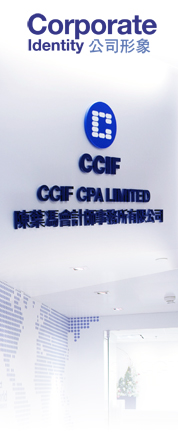
To implement our change of identity, we renovated our office as well. The new look of CCIF is contemporary and clean. Blue tone is used to link the logo and the interior. The layout design is team based and functional with individual teams having their own section for efficient teamwork and easy access to supporting staff. The renovation achieves a balance between practicality and aesthetics. We did our best to recycle the furniture and fixtures – not to create unnecessary burden to our environment.